Google’s Mobilegeddon has set new standards for what a mobile web experience should be. Today more than half of global web traffic is mobile-generated. However, the apps industry is keeping pace by introducing new approaches to their development and new app styles like Progressive web apps. In doubt about what to choose? Read on to understand how a responsive website and a mobile app can benefit your business in terms of audience reach, industry type, functionality as well as maintenance complexity.
Responsive and adaptive websites
Responsive websites, like any other, consist of a set of interconnected HTML pages that can be opened via any browser.
The difference is, they are designed to adapt to the way the content is rendered on a variety of screen sizes with the help of CSS media queries. The idea is to provide a user with a perfect experience regardless of the device they access the website. It saves the need to resize anything manually to view content.
One should not confuse responsive and adaptive websites.
The latter term is used to name a website that leverages different layouts designed for a certain set of screen sizes. It means that a developer should bear in mind all the possible existing size and resolution options. If the website does not support one of them, it will not be displayed decently.
Meanwhile, the former type implies that there is only one layout that is “fluid” and adapts automatically the way it is optimal for the given screen.
The animation demonstrates the basic difference between the two.
 Responsive web design is above, adaptive below. Source: css-tricks.com
While both ideas have their right to exist, a responsive website approach is recommended by Google.
The history of website adapting its layout to the browser viewpoint width parameters can be traced back to 2001 and Audi.com.
The term “responsive web design” itself was coined in 2010 by Ethan Marcotte. Mashable called 2013 “the year of responsive web design”.
But it was not until 2015 when the “responsive” idea was reinforced by Google. The company announced that it will adjust its search mechanisms to promote the rankings of mobile-friendly pages. The concept was even dubbed Mobilegeddon.
Google believes that the measure will lead to better user experience, since “the desktop version of a site might be difficult to view and use on a mobile device”.
Google also states, that “61% of users are unlikely to return to a mobile site that they had trouble accessing from their phone, and 40% go to a competitor’s.”
Statista claims, that 52.5 % of all website traffic worldwide in 2018 is generated through mobile phones.
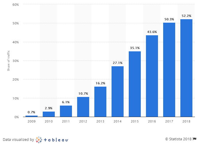 Percentage of all global web pages served to mobile phones from 2009 to 2018
Thus, well-designed mobile experience is no more a matter of preference, but an apparent need for businesses.
Mobile apps
One of the pivotal moments that gave rise for mobile apps was a 2007 Steve Jobs Keynote Speech, where the concept of the first iPhone was unveiled. A year later, on July 10, 2008, Apple launched the first ever Apple App Store with 500 apps. A few months later, on 22 October 2008, Android Market ( Google play since 2012) with 50 apps showed up. The word “app” was named as “Word of the Year” by the American Dialect Society for 2010.
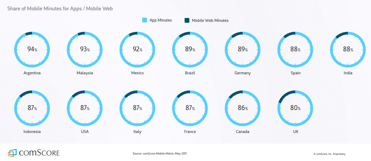
After almost a decade, apps hold a predominant position when it comes to the share of mobile time. More than 80% of mobile minutes worldwide are spent on apps.
There are three main options for creating a mobile app: native, hybrid and cross-platform.
A native mobile app is coded in a specific programming language for each targeted platform, such as Objective C and Swift for iOS or Java, Kotlin and C/C++ for Android.
Hybrid mobile apps are designed for multiple operating systems. They are written using web technologies (like JavaScript, CSS, and HTML5) and then wrapped into a mobile app with WebView to run on each platform. The most popular frameworks for hybrid app development are PhoneGap, Cordova, and Ionic.
Like the hybrid, cross-platform mobile apps are aimed at running on different platforms. However, they do not wield HTML and CSS and talk directly to the mobile OS.
Mobile application development is one of Belitsoft’s top priorities. Learn more about why you should choose us for your next mobile app.
Do you want to reach a broader audience?
Typically, the first move one is likely to do when coming across an unfamiliar brand is google it.
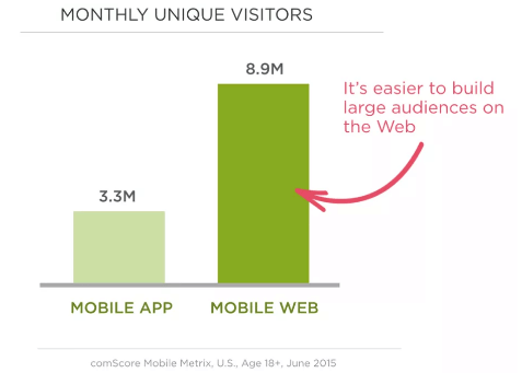
While both apps and responsive websites can appear in search results, a responsive website is made for both mobile and desktop browsers and allows to capture a broader audience.
Moreover, one generally tends to explore an unfamiliar brand via a website first. The reason is a user does not have to download or install it, thus they should not allocate some treasured mobile storage for an app of a brand they do not know.
‘Mobile web is an acquisition channel, and may be first time people are experiencing our company. Once they have a strong relationship with the brand, we use the app to create personalized experiences that cater to the customer.’
Director of mobile, large US office supply retailer
To earn users’ loyalty to the brand, companies cook up all kinds of bonus systems.
For example, Starbucks Rewards app enables its users to receive stars for purchases that add up to some free food and drinks later.
That is, mobile websites are a good choice for establishing initial awareness and engagement. However, for more personalized customer-user interactions and retention, it is better to go with an app.
Another advantage of a responsive website is that it can be accessed via any device regardless of the OS it is based on.
The only thing to bear in mind is HTML5 compatibility. In fact, all of the big-league browsers like Internet Explorer, Edge, Firefox, Chrome, Safari, Opera, Safari for IOS and Android-optimized browsers support HTML5, but some features vary from browser to browser.
What about time and resources?
Responsive website development will have a much lower price tag and time needed than a native mobile app build up.
The reason is that instead of one responsive website you have to develop at least two apps from scratch (one for Android and one for iOS) and hire a development team for each version. This, in turn, entails two times more work and resources while bug fixing and adding new features. It also makes maintenance cost higher.
Yet, responsive websites can’t provide a full-scale mobile experience (more on it below) and you still have to pay for domain and hosting.
However, if you still do want an app, but do not have resources and time for native apps development, you may consider going hybrid or cross-platform. Both approaches require building only one app for all platforms, which means shorter development time (including later updates and new features integration) and efficient maintenance.
For example, Ionic 2 code is nearly 100% reusable. Such apps will run seamlessly regardless of the OS. Though some UI components still need to be adjusted to the target platform requirements.
React Native and Xamarin allow to retain approximately 90% and up to 96% of code respectively.
Read more about how Ionic 2, React Native and Xamarin compare in our blog.
By the way, to distribute your apps in market stores it is also necessary to pay the registration fee. The price is one-time 25$ to Google Play and annual 99$ for the Apple Developer Program or 299 USD for the Apple Developer Enterprise Program to App Store.
Are you going to update a lot?
A website requires fewer efforts and costs for its maintaining compared to mobile apps. For example, you only have to edit your website once and the upgrades will be immediately active across all kinds of devices.
Meanwhile, editing a native mobile app is a more knotty procedure. After an upgraded version for each OS type is prepared, it should be approved by the marketplaces.
On average, it takes from 24 hours for 50% of apps to 48 hours for over 90% of apps to be reviewed on App Store. What for Google Play, it suggests waiting for at least 24 hours for an update to appear before contacting its support team.
Besides, an end-user either has to set automatic updates on or upgrade an app manually after each update to get the changes.
Since hybrid apps leverage HTML5, you get an ability to update an app without asking a user to upgrade it on their device. It allows for easier app management by enabling developers to implement updates and fix bugs as needed. In addition, there is no waiting time to get the update approved.
Cross-platform apps built with React Native can also benefit from the Over-the-Air update feature.
However, for some significant upgrades like adding new features, it is recommended to send out an app to an app store for review.
What industry are you aiming at?
User’s choice of a means for accessing the Internet largely depends on a type of activity they want to engage in. IAB conducted a Global mobile experience study, where they divided mobile activities into 3 groups: functionality, entertainment, and communications.
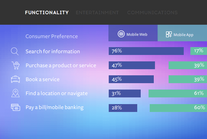
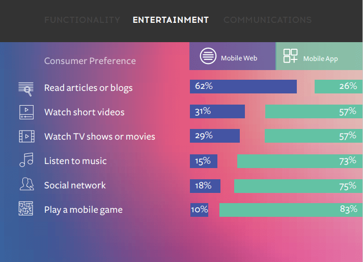
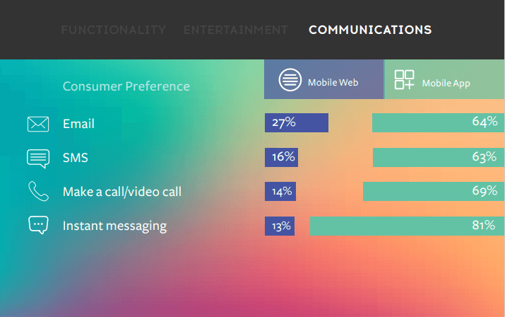
Consumers tend to use mobile web for utility-directed tasks like searching, booking, and purchasing products.
When entertainment and communications come into play, mobile apps are, for the most part, a far more favored alternative.
Another research further proves the idea that things like communication, weather, games, music, photo and video, physical activity tracking, and daily management are better off as an app.
Imagine that if it were not for an Instagram app, you should open a mobile browser, log in and only then could you see that awesome picture of a friend. All this instead of simple tap on the app’s icon.
‘Though responsive design is much better than having to ‘pinch-and-zoom’, it isn’t an optimized experience for mobile visitors. At its core, responsive design makes the desktop experience look good on mobile, but it doesn’t address the specific needs of mobile visitors.’
Talia Wolf, listed among influential voices in conversion optimization
Do you need offline mode?
Responsive websites require a constant Internet connection. Of course, you can save a certain webpage for offline reading both on iOS and Android, but for anything else you need to stay online.
Apps can work both online and offline. While it may not be such an issue for the “first world” countries, it makes a difference for developing states.
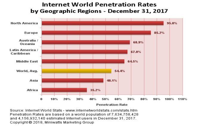
So when your users must have access to an app’s data anytime and anywhere, better go with an app.
Some examples of apps that provide offline functionality are:
- Google Maps, that offers offline access to maps and turn-by-turn navigation. However, it's necessary to download the area of interest from Google Maps in advance to use it offline.
- Spotify - a music streaming app, Premium version of which allows users to enjoy their music offline.
- A variety of dictionaries like Merriam Webster, Dictionary.com, and WordWeb to name a few.
Take a look at our mobile app portfolio to see some examples of apps with offline mode.
Do you need mobile native features?
Mobile devices earned their popularity not just because they fit in the pocket, but also because they are stuffed with such features as Bluetooth, camera, GPS, contact list, speech recognition and many more.
Since native mobile apps are designed specifically for each target platform, they can immediately access all device-specific features. It is also feasible to leverage required mobile functionality in hybrid apps with the help of PhoneGap or Cordova. Cross-platform React Native apps can also access native functionality using native modules.
Mobile internet browsers are helping to bridge the gap between an app and a website. However, the user experience may depend on the OS and browser one chooses.
While both iOS Safari and Android Chrome can support geolocation, they still lack geofencing functionality.
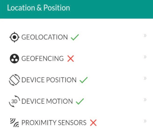 Android Chrome. Source: https://whatwebcando.today
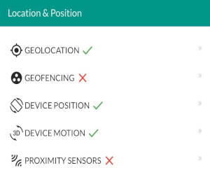 IOS Safari. Source: https://whatwebcando.today
Geofencing integrated into mobile apps is a powerful tool for mobile marketers to boost engagement. It enables triggering push notifications every time a user enters a certain location. The idea is to drive interaction by targeting the right people in the right places and at the right time.
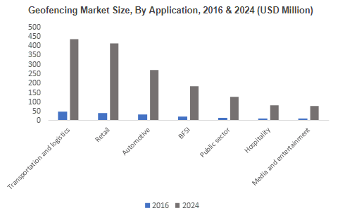
According to a Global Market Insights report, the geofencing market size was estimated at over 200 million in 2016 with a CAGR of over 28% from 2017 to 2024.
Walmart was one of the first retailers to introduce geofencing in its app with a “Store Mode”.
‘When you enter the store with the mobile app, say you're in Store Mode, you can search the store, and it can also give you the local ad for the store you're in so you know what's on sale in that store. We were one of the first retailers to do that.’
Ojonimi Bako, director of innovation for Walmart Labs
By the way, not every mobile browser even supports push notifications.
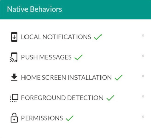 Android/Chrome. Source: https://whatwebcando.today
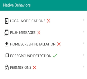 Safari. Source: https://whatwebcando.today
 IOS/Chrome. Source: https://whatwebcando.today
It means that even if your iPhone or iPad has a browser like Chrome installed, you still will not be able to receives pushes on your device. Android browsers, however, favor the feature.
Why does it matter?
Leanplum says, that promotional push notifications lead to an almost tenfold increase in purchases and 16 % more money spend with your brand.
Neither iOS Safari nor Android Chrome browser won’t be useful if one wants to embrace NFC.
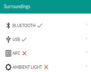 Android Chrome. Source: https://whatwebcando.today
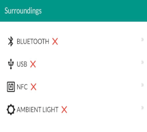 IOS Safari. Source: https://whatwebcando.today
The technology is widely implemented in the mobile payment industry. Apps like Apple Pay, Samsung Pay or MasterCard PayPass are vivid specimens.
Yet NFC is not only about payments.
- For example, InstaWifi app allows to easily share WiFi login information through NFC tag or QR code.
- EndlessID is a great idea of NFC implementation in healthcare. The app enables sharing of medical and emergency contact information, ensuring the safety of your loved ones.
BelitSoft has extensive expertise in healthcare solutions development. Write to us to get a free quote!
A responsive website can also strip you of access to contacts, SMS sharing, task scheduling, and wake lock.
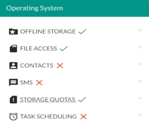 Android Chrome. Source: https://whatwebcando.today
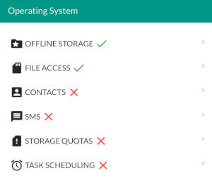 IOS Safari. Source: https://whatwebcando.today
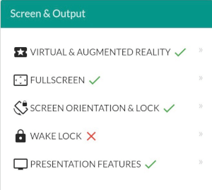 Android Chrome. Source: https://whatwebcando.today
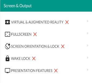 IOS Safari. Source: https://whatwebcando.today
To crown it all, with iOS websites one also will not be able to enjoy the features like speech recognition, VR, AR, fullscreen mode, access to battery status and some others.
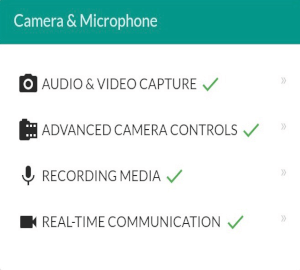 Android Chrome. Source: https://whatwebcando.today
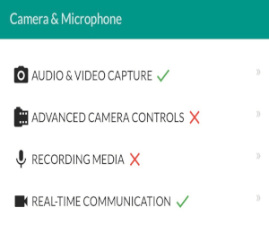 IOS Safari. Source: https://whatwebcando.today
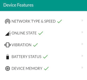 Android Chrome. Source: https://whatwebcando.today
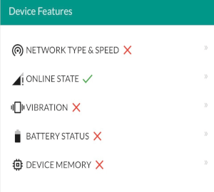 IOS Safari. Source: https://whatwebcando.today
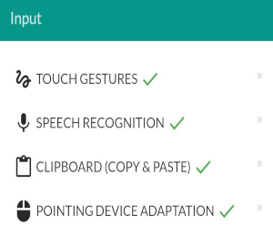 Android Chrome. Source: https://whatwebcando.today
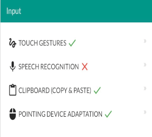 IOS Safari. Source: https://whatwebcando.today
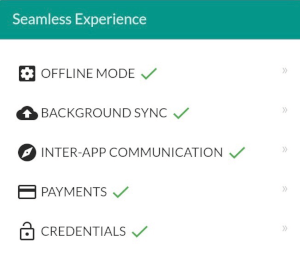 Android Chrome. Source: https://whatwebcando.today
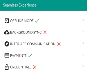 IOS Safari. Source: https://whatwebcando.today
What about Progressive Web Apps?
Introduced in 2015 by Google, Progressive web apps (PWAs) are roughly defined as a website that looks and behaves as if it is a mobile app. PWAs are built to take advantage of native mobile device features, without requiring the end user to visit an app store, make a purchase and download software locally. Instead, a PWA can be located with a search engine query and accessed immediately through a browser.
There is no need to write different code for each platform - one app will do it all. However, its functionality may be still limited by browsers. For example, Firefox adds icon badges to a PWA’s home screen image, while Chrome still does not.
Apple, though neglecting PWAs for a long time, has also finally introduced its main components - Service Workers and Web App Manifest - to Safari 11.1. It allows Safari-run PWAs to work offline and be pinned to the home screen, providing more native-like experience.
Yet, Apple, unlike others, still does not allow its PWA users to get web push notifications.
Brands like Twitter, Forbes, Washington Post, Flipkart Lite and Aliexpress have successfully implemented a new app-style and are reaping the rewards.
For example, Aliexpress PWA resulted in a 74% increase in time spent per session and 104% conversion rate growth for new customers.
With its PWA, Forbes saw a 43% increase in sessions per user compared to the previous mobile site, and engagement was up 100%.
Twitter designed its PWA with the focus on instant loading, user engagement, and lower data consumption. It helped reduce a size app from 23.5MB Android version to only 600KB of PWA. By this, Twitter aims at covering a broader audience, including those of emerging markets. As a result, the number of pages viewed per session increased by 65% and the bounce rate decreased by 20%.
Conclusion
Choosing between a responsive website and a mobile app is not a black-and-white issue. The decision should be made based on your business’ goals and resources. While apps generally provide a more personalized experience, going responsive can attract a broader audience and save a lot of money. Besides, a mobile approach can reasonably include both options.
Rate this article
Our Clients' Feedback


Belitsoft has been the driving force behind several of our software development projects within the last few years. This company demonstrates high professionalism in their work approach. They have continuously proved to be ready to go the extra mile. We are very happy with Belitsoft, and in a position to strongly recommend them for software development and support as a most reliable and fully transparent partner focused on long term business relationships.
Global Head of Commercial Development L&D at Technicolor